Our task was to revamp a brand that had been largely unchanged for over a decade. The goal was to appeal to a wider demographic - specifically, active, millennial pet owners.
Classic field guides and wood carvings were the primary inspiration for the redesigned logo (right).
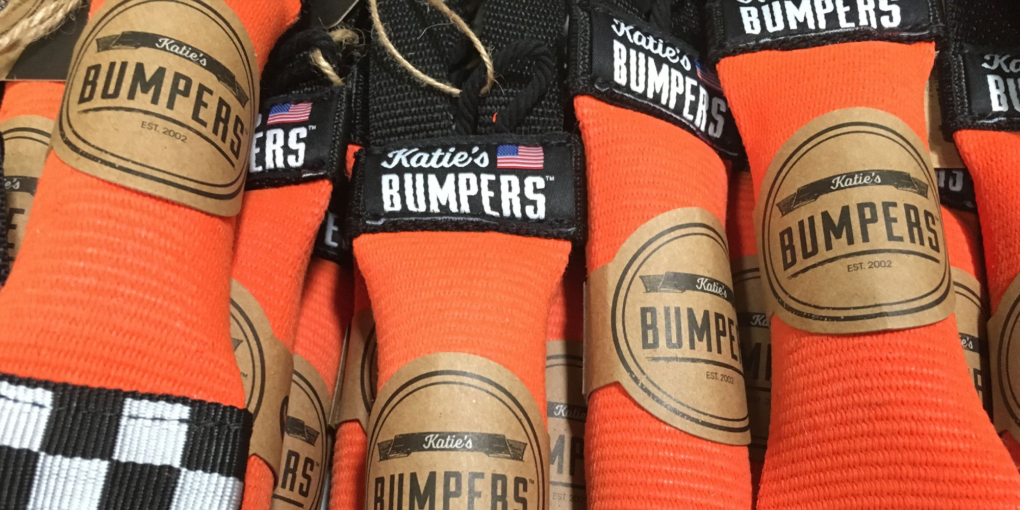
The texture on the primary and secondary logos and logomark were lifted from the toys' durable firehose material.
These icons suggested which outdoor activities were best suited for the toy - water play, fetch, and tug.
Each size was assigned a colour so customers would be able to identify what they needed at a glance. Yellow for Small, orange for Medium, and blue for Large.
The cigar bands wrapped around each toy featured a call to action in order to encourage social media engagement.
Both the hang tags and cigar bands were made from recycled cardboard. Twine was chosen for the attachment to further the rugged, outdoorsy aesthetic.
Product photos for the website were also reshot to achieve a more cohesive look.