KONG Equine.png

KONG Equine (2021)

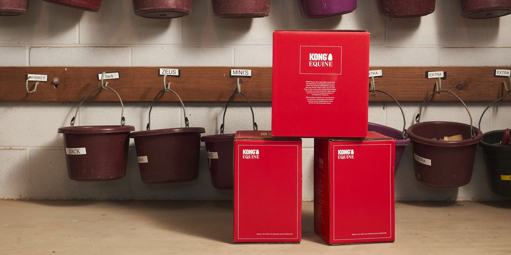
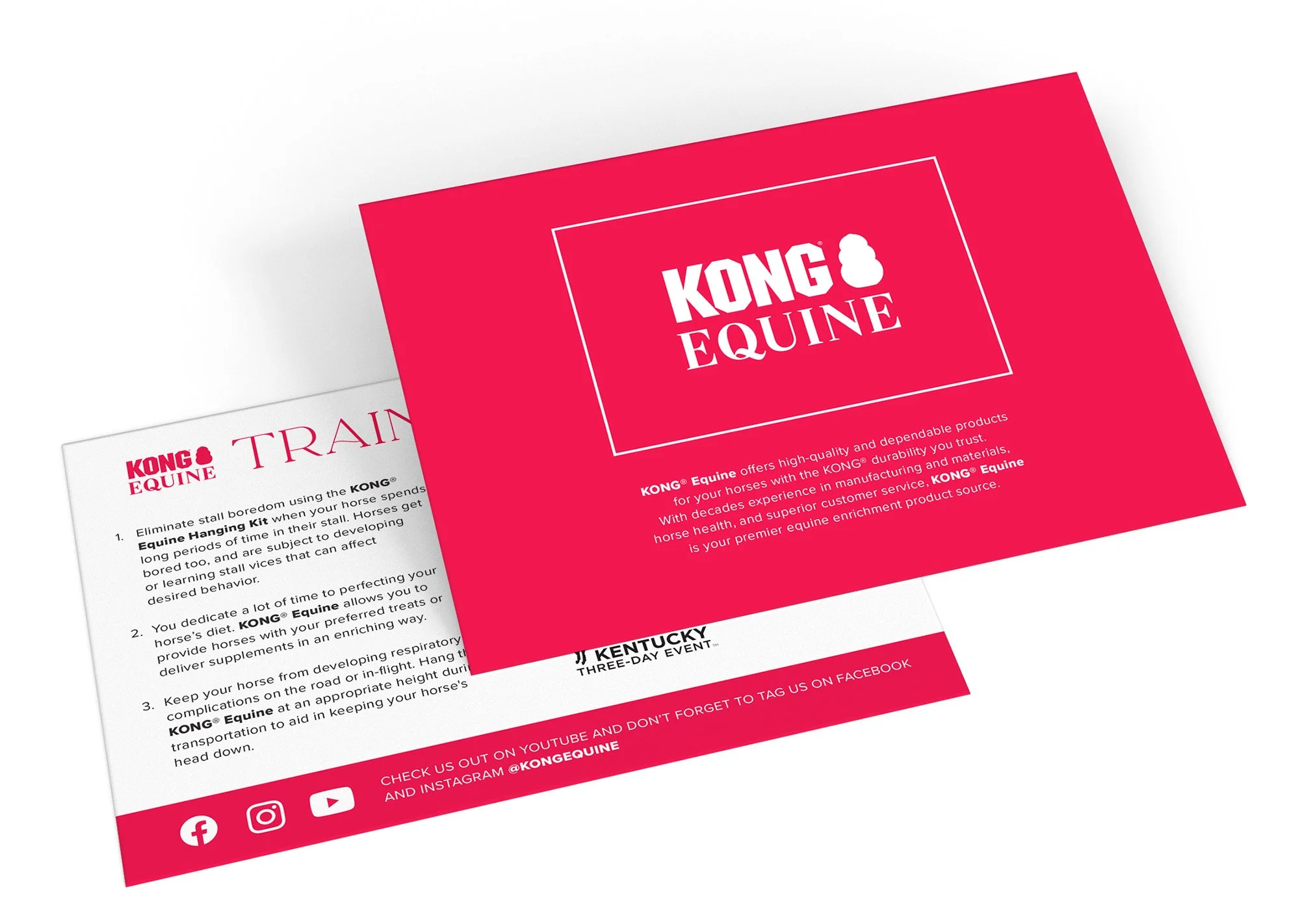
Brand Development, Package Design

KONG-Equine_Box.jpg
Our goal was to market the KONG Equine toy line as being high quality, <b>splurge</b> items while still being <b>accessible</b> to the average horse owner.

Our goal was to market the KONG Equine toy line as being high quality, splurge items while still being accessible to the average horse owner.

Using a serif typeface with varied line weight balanced the block-like "KONG" logomark, making the overall logo feel light and elegant in comparison to KONG's existing toy lines.

Using a serif typeface with varied line weight balanced the block-like "KONG" logomark, making the overall logo feel light and elegant in comparison to KONG's existing toy lines.

Though separate from the KONG Company’s main line of toys, KONG Equine still needed to fit within their established branding. This was done primarily through using KONG's iconic red.

Though separate from the KONG Company’s main line of toys, KONG Equine still needed to fit within their established branding. This was done primarily through using KONG's iconic red.

KE12G.png
KE12N.png
Using a single, bold colour and keeping the design sleek and simple allowed the packaging to stand out amongst competing products in a retail environment.

Using a single, bold colour and keeping the design sleek and simple allowed the packaging to stand out amongst competing products in a retail environment.

KEquine_Social Guidelines.png
An international influencer program was set up to market the products on YouTube and Instagram.

An international influencer program was set up to market the products on YouTube and Instagram.