
MYOS Pet (2020)
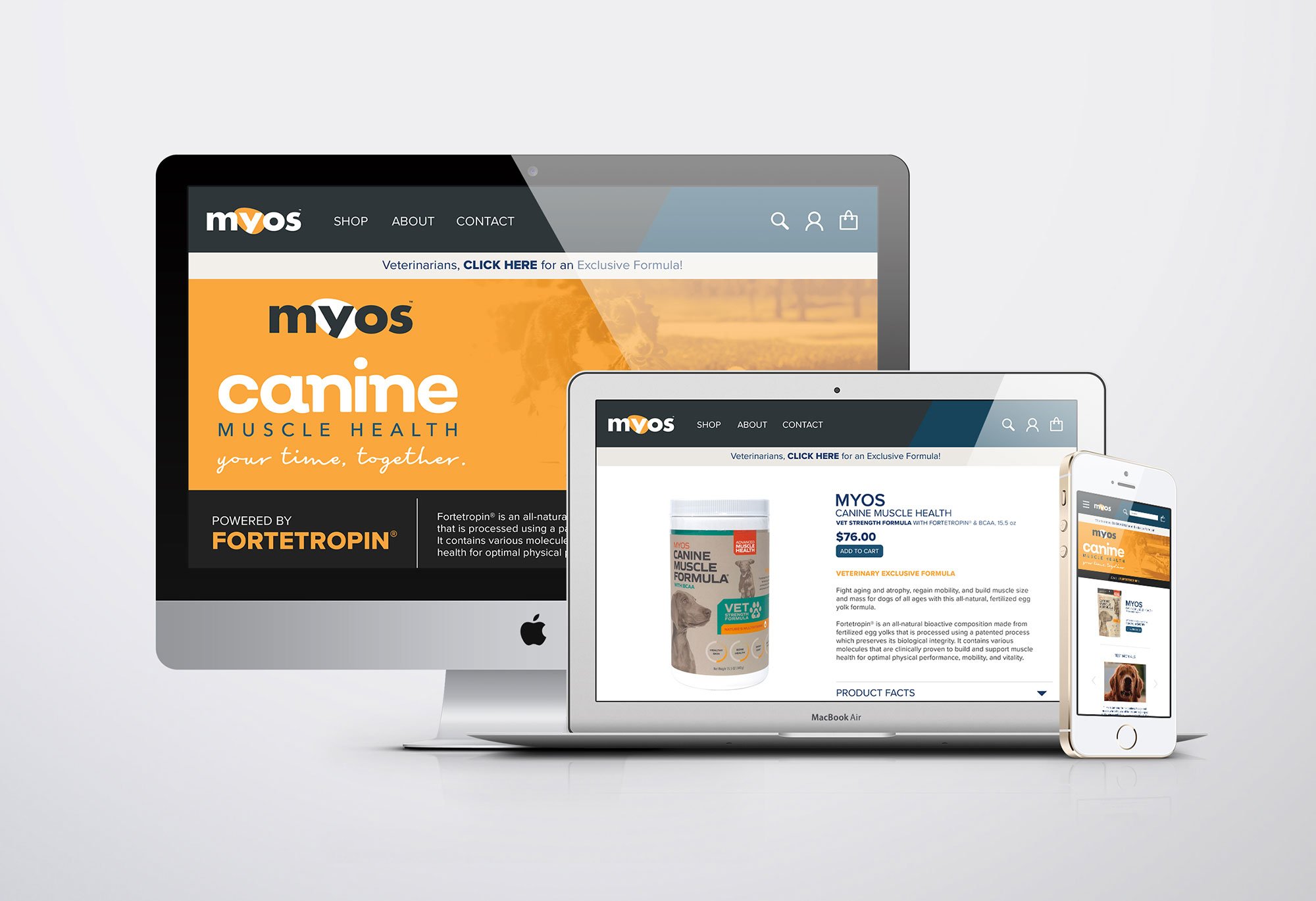
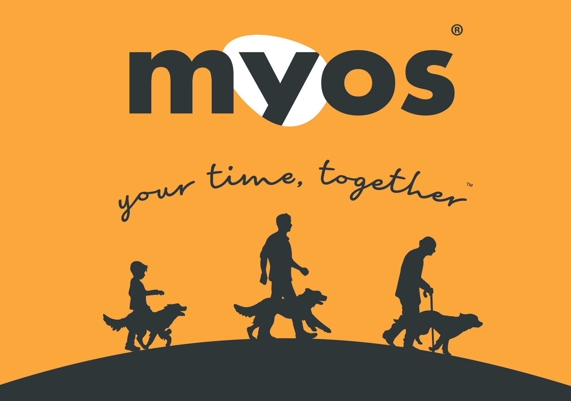
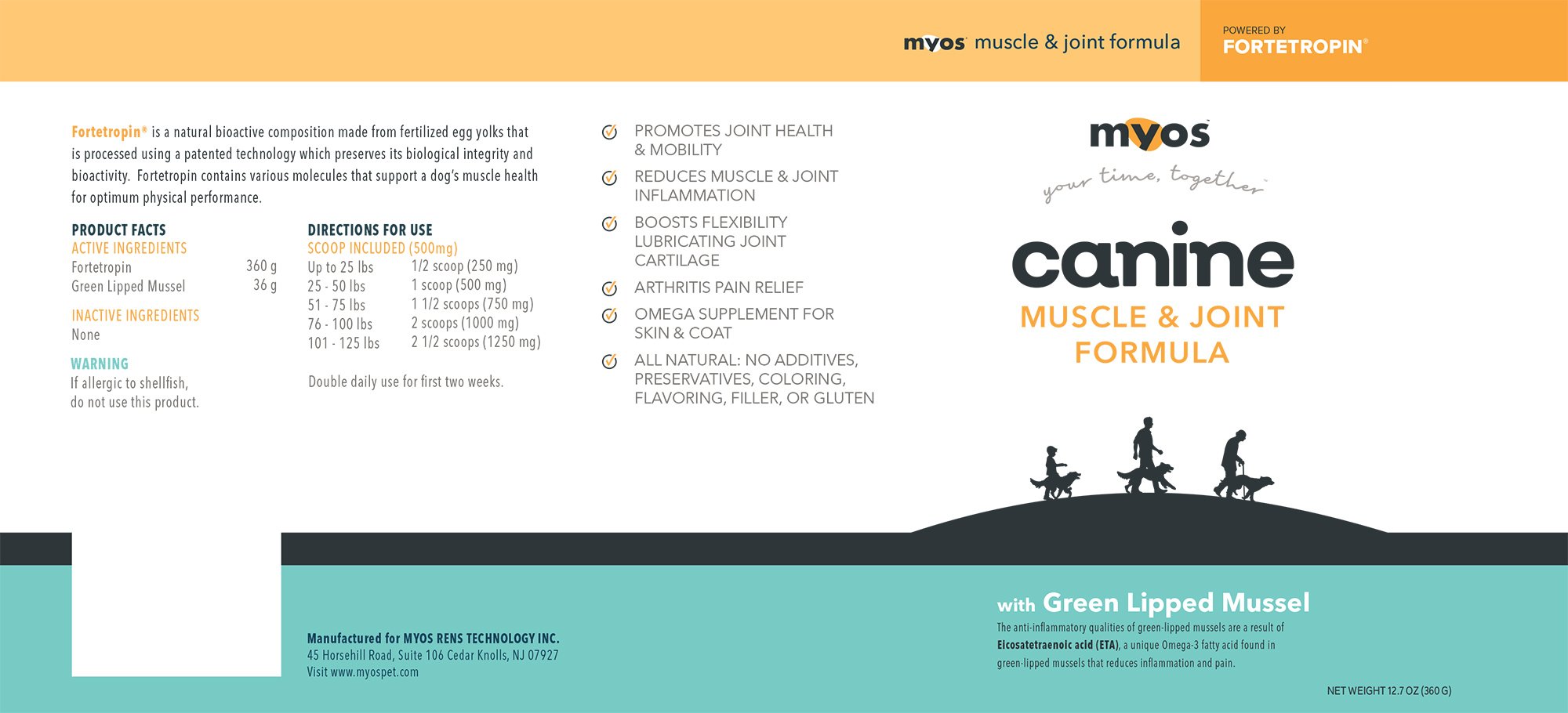
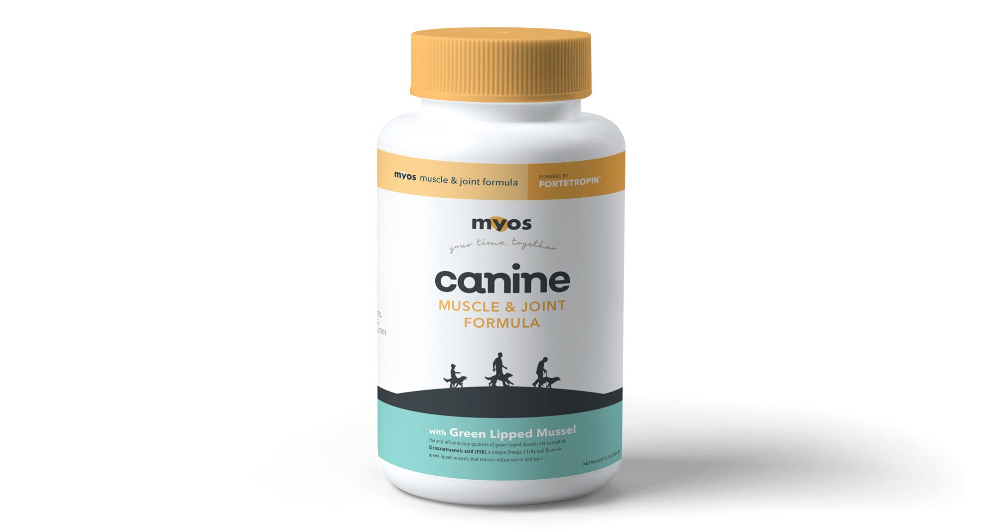
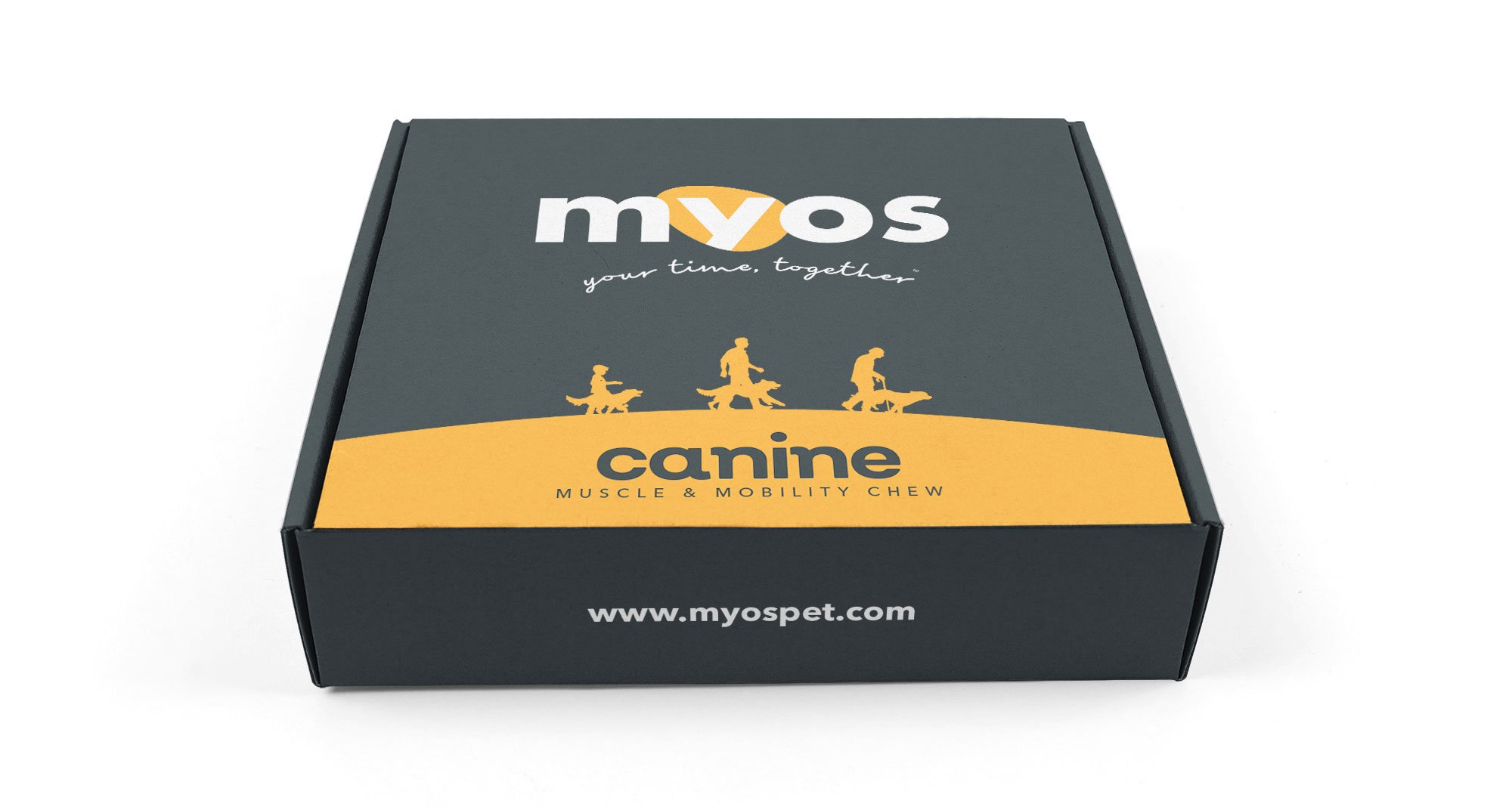
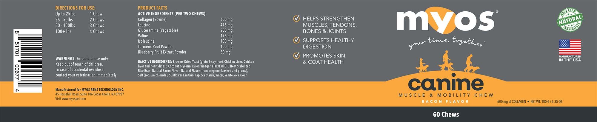
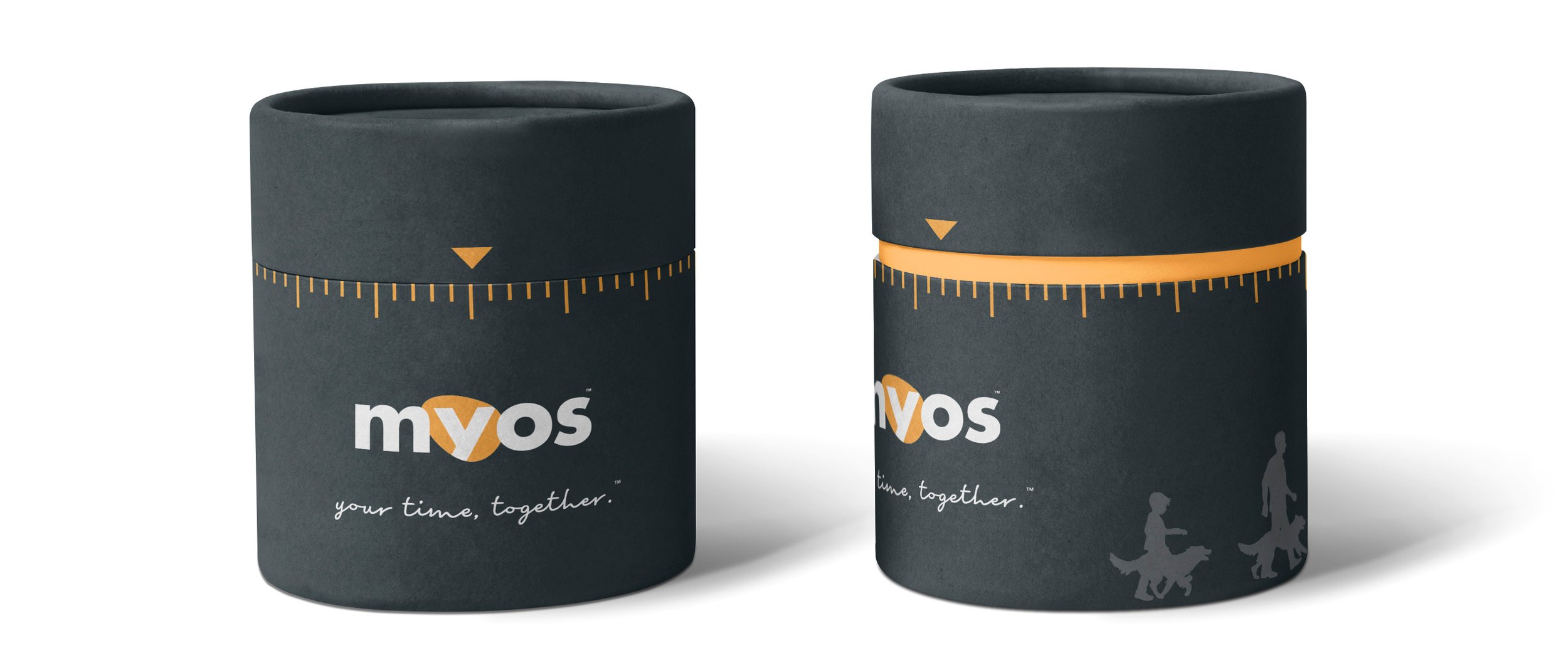
Brand Development, Package Design, Illustration

The first challenge was to design a new logo that would better reflect the brand's identity.


The supplement's main ingredient is a proto-lipid derived from egg yolks, so we chose to use yellow as the brand's identifying colour. An egg shape was also incorporated.


After some collaborative brainstorming, we determined that the main selling point of this supplement was the possibility of having more time with your pet.


The original packaging used a similar colour palette to existing products; our redesign opted for a brighter colours, with a primary focus on yellow.


A promotional mailer was also suggested for the launch of their newest product:


A supplemental dog treat that helped maintain muscle and joint health.

The sample cannister would be placed in a cylindrical box designed to look like an egg timer.
The featured samples are what our creative team presented to the client. Ultimately, they opted to go for a simplified version which took certain design elements from our pitch.
Elements of this project were done under the supervision and direction of the Marketing Director, Art Director, and client.